> ## Documentation Index
> Fetch the complete documentation index at: https://help.experro.com/llms.txt
> Use this file to discover all available pages before exploring further.
# Components
Components are **reusable blocks**—groups of related fields defined once and then embedded in multiple Models. Think of them as mini‑schemas for common content patterns like banners, sliders, or testimonial cards. By using Components, you ensure consistency, simplify maintenance, and speed up page assembly.
## Why Use Components?
* **Reusability**: Define a set of fields once and reuse it across many Models (e.g., “Author Bio,” “FAQ Item”).
* **Consistency**: All instances of a component share the same schema and validations, so you never end up with “close but different” field sets.
* **Modularity**: Break complex pages into manageable building blocks that editors can add, reorder, and configure independently.
## When to Use Components
* **Banners & Slideshows**: Define a “Banner” component with title, image, and link fields to power hero carousels.
* **Feature Blocks**: Create a “Feature Card” component with icon, headline, and description fields.
* **Repeated Layouts**: Any section that appears multiple times or across pages (e.g., FAQs, testimonials).
## How to Create & Use Components
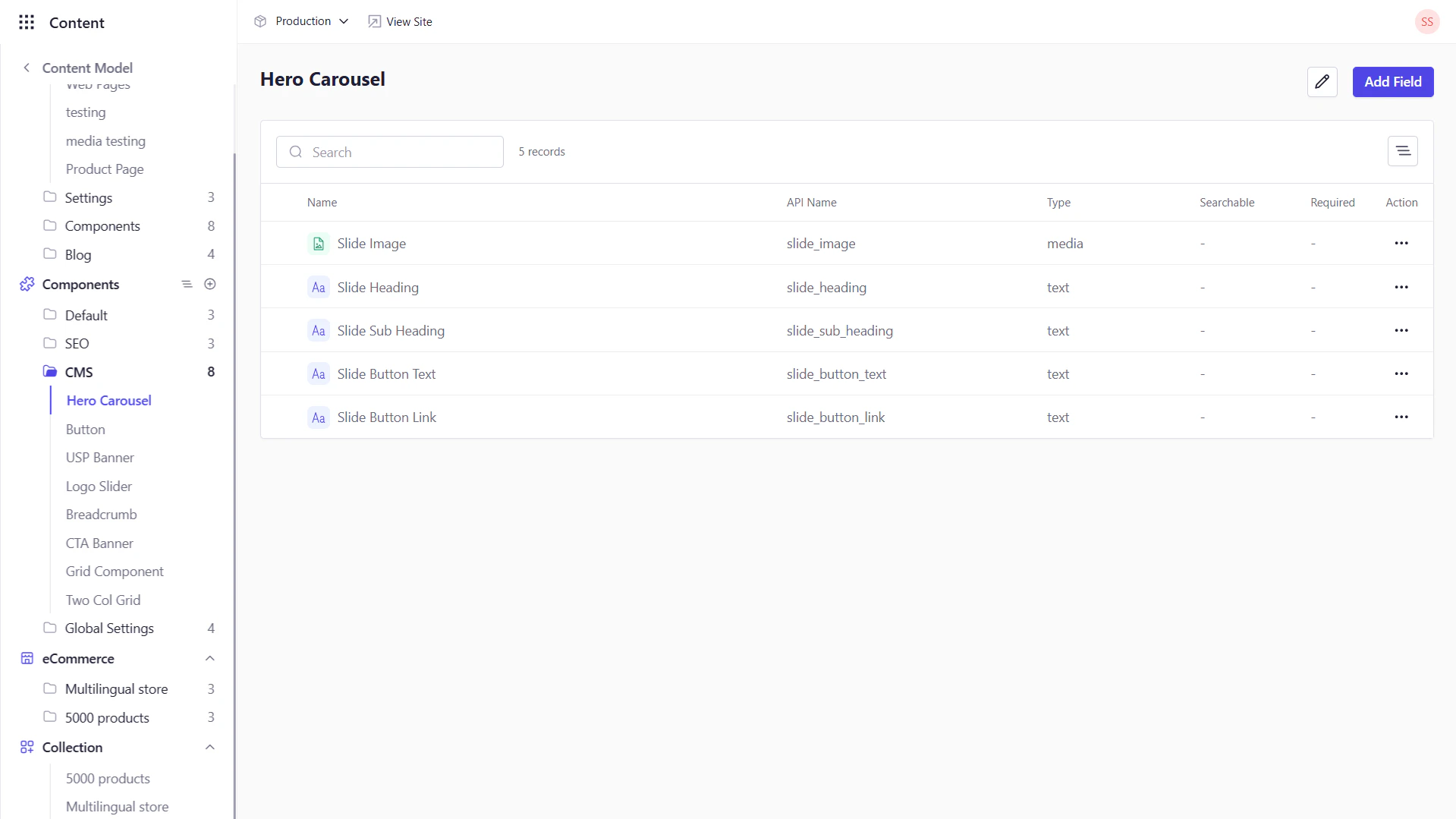
### 1. Navigating to the Components Area
1. In the left‑hand sidebar, click **Content Model** to expand its submenu.
2. Select **Components** to view the list of all existing components on the navigation panel from your workspace.
 ### 2. Creating a New Component
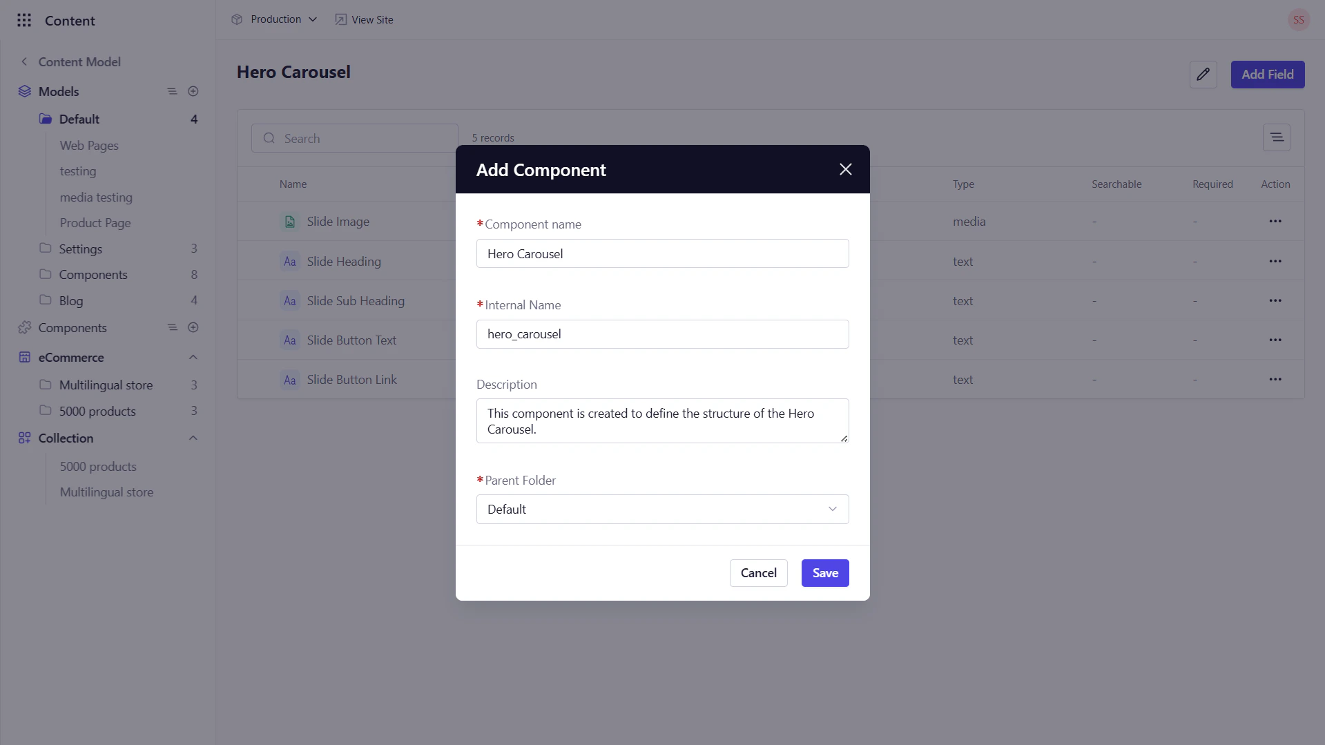
1. Click **+** followed by **Add Component** from the Components list on the navigation panel.
2. In the dialog, fill out:
* **Compnent Name**: e.g., `Banner` or `Hero Slide`
* **Internal Name**: Auto‑generated snake\_case identifier (editable)
* **Description**: *(Optional)* Brief summary of its purpose
* **Parent Folder**: Organize into a folder
3. Click **Save** to create the component and open its editor.
### 2. Creating a New Component
1. Click **+** followed by **Add Component** from the Components list on the navigation panel.
2. In the dialog, fill out:
* **Compnent Name**: e.g., `Banner` or `Hero Slide`
* **Internal Name**: Auto‑generated snake\_case identifier (editable)
* **Description**: *(Optional)* Brief summary of its purpose
* **Parent Folder**: Organize into a folder
3. Click **Save** to create the component and open its editor.
 ### 3. Defining Component Fields
Once your component is created, you’ll land on its **Fields** tab:
1. Click **+ Add Field**.
2. Choose a field type (Text, Rich Text, Media, Boolean, Relation, etc.).
3. Configure the fields as per [Adding Fields to Your Model](/content/content_model/fields/add_fields).
4. Click **Save Field** and repeat for each attribute.
### 4. Embedding a Component in a Model
To make a component available in a content type:
1. Go to **Content Model → Models** and open your target Model.
2. On the **Fields** tab, click **+ Add Field** → **Component**.
3. Select the target component.
4. Choose **Repeatable** (allows multiple instances) or **Single** (one instance).
5. Click **Save**.
### 3. Defining Component Fields
Once your component is created, you’ll land on its **Fields** tab:
1. Click **+ Add Field**.
2. Choose a field type (Text, Rich Text, Media, Boolean, Relation, etc.).
3. Configure the fields as per [Adding Fields to Your Model](/content/content_model/fields/add_fields).
4. Click **Save Field** and repeat for each attribute.
### 4. Embedding a Component in a Model
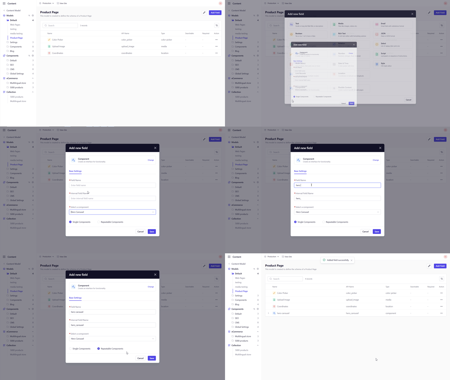
To make a component available in a content type:
1. Go to **Content Model → Models** and open your target Model.
2. On the **Fields** tab, click **+ Add Field** → **Component**.
3. Select the target component.
4. Choose **Repeatable** (allows multiple instances) or **Single** (one instance).
5. Click **Save**.
 ### 5. Populating Component Entries
Once a component is embedded in a Model:
1. Navigate to **Content Library**, and open an entry of that Model.
2. Locate the component field (e.g., **Banner**).
3. Click **Add new** to insert an instance—fill out the component’s fields (Title, Link, Image).
4. For repeatable components, click **Add new** multiple times to add several instances (e.g., carousel slides).
5. Save or publish your entry.
### 6. Use Case: Hero Carousel Slides
As an example, build a **Hero Carousel** component:
1. **Define the Component** with fields:
* Slide Title (Text)
* Slide Subtitle (Text)
* Button Text (Text)
* Button Link (Text)
* Slide Image (Media)
2. **Embed** it as a repeatable component in your Landing Page Model.
3. **Create Slides** in **Content Library** by adding 3–5 instances under the carousel field.
Your front‑end can then iterate over the `hero_carousel` array to render a dynamic slideshow.
### 7. Editing & Deleting Components
* **Edit**: Navigate to the target component, click the pencil icon at the top right of the screen to update fields or settings.
* **Delete**: Click the trash‑can icon to remove a component definition.
Deleting a component removes it from all Models and entries that use it.
## Best Practices
1. **Keep Components Focused**: Design each component for a single purpose.
2. **Limit Nesting**: Avoid deeply nested components to maintain clarity.
3. **Name Clearly**: Use descriptive names and identifiers so both editors and developers know each block’s role.
4. **Communicate Changes**: Modifying a component schema affects every page using it—coordinate updates with your team.
With Components in place, you can assemble rich, modular page sections quickly and maintain them easily.
### 5. Populating Component Entries
Once a component is embedded in a Model:
1. Navigate to **Content Library**, and open an entry of that Model.
2. Locate the component field (e.g., **Banner**).
3. Click **Add new** to insert an instance—fill out the component’s fields (Title, Link, Image).
4. For repeatable components, click **Add new** multiple times to add several instances (e.g., carousel slides).
5. Save or publish your entry.
### 6. Use Case: Hero Carousel Slides
As an example, build a **Hero Carousel** component:
1. **Define the Component** with fields:
* Slide Title (Text)
* Slide Subtitle (Text)
* Button Text (Text)
* Button Link (Text)
* Slide Image (Media)
2. **Embed** it as a repeatable component in your Landing Page Model.
3. **Create Slides** in **Content Library** by adding 3–5 instances under the carousel field.
Your front‑end can then iterate over the `hero_carousel` array to render a dynamic slideshow.
### 7. Editing & Deleting Components
* **Edit**: Navigate to the target component, click the pencil icon at the top right of the screen to update fields or settings.
* **Delete**: Click the trash‑can icon to remove a component definition.
Deleting a component removes it from all Models and entries that use it.
## Best Practices
1. **Keep Components Focused**: Design each component for a single purpose.
2. **Limit Nesting**: Avoid deeply nested components to maintain clarity.
3. **Name Clearly**: Use descriptive names and identifiers so both editors and developers know each block’s role.
4. **Communicate Changes**: Modifying a component schema affects every page using it—coordinate updates with your team.
With Components in place, you can assemble rich, modular page sections quickly and maintain them easily.