> ## Documentation Index
> Fetch the complete documentation index at: https://help.experro.com/llms.txt
> Use this file to discover all available pages before exploring further.
# Create widget
# How to create a widget
#### What is widget?
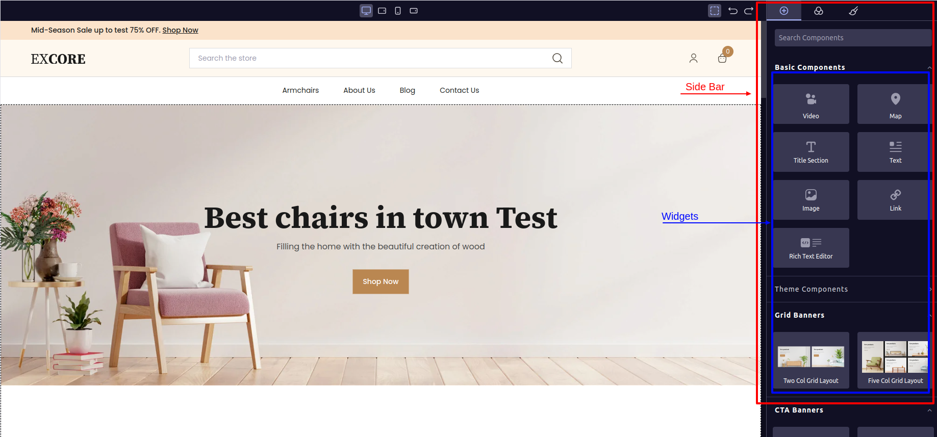
When you open Experro Visual Builder, you'll notice a side panel on the right sidebar labeled "Basic Components", "Theme Components", etc. Within each section, you'll find various icons representing widgets. These widgets can be dragged and dropped onto the page. Once a widget is dropped, the associated component will be rendered on the page.
 #### How can you create a Widget?
To create a widegt you can follow the below steps,
Follow the bellow directory structure in `base-theme`.
```txt theme={null}
src
└── components
├── cms-library
└── index.ts
├── widgets
└── index.ts
└── index.ts
```
##### Step 1:
Create a component folder in `cms-library`.\
e.g,
The folder named `exp-test-component` contains three files:
1. `index.ts`: This file serves as an entry point for the component.
2. `exp-test-component.tsx`: Responsible for returning the component's JSX.
3. `exp-test-component-controller.tsx`: Implements all the business logic of the component. This includes tasks such as fetching data through API calls and manipulating the data that will be rendered by the component.
##### Step 2:
Add an entry for the newly created component to the `index.ts` file located in the `components` folder. You will understand how to do this by examining the contents of the `index.ts` file.
##### Step 3:
Create a new file in the Widget folder that will be responsible for displaying the `widget` on the Visual Builder's side panel.
##### Step 4:
* To view the widget, you need to register the newly created widget file in the `index.ts` file of the widget folder.
* In the `index.ts` file within the widget folder, you will notice that all existing widgets are imported, and their files are added to a `widget` named array. This process ensures that your newly created widget becomes visible on the side panel of the Visual Builder.
After following the aforementioned steps, you will be able to adhere to the structure outlined below.
```txt theme={null}
src
└── components
├── cms-library
├── exp-test-component
├── exp-test-component.tsx
├── exp-test-component-controller.tsx
└── index.ts
├── widgets
├── exp-test-component.tsx
└── index.ts
└── index.ts
```
##### Let's take a look at the content of newly created component,
`exp-test-component.tsx`
```js theme={null}
/**
* Renders an exp-test-component component.
* @param props - Components props.
* @returns
*/
const ExpTestComponent = (props: any) => {
const {
id,
component_content,
} = props;
return (
#### How can you create a Widget?
To create a widegt you can follow the below steps,
Follow the bellow directory structure in `base-theme`.
```txt theme={null}
src
└── components
├── cms-library
└── index.ts
├── widgets
└── index.ts
└── index.ts
```
##### Step 1:
Create a component folder in `cms-library`.\
e.g,
The folder named `exp-test-component` contains three files:
1. `index.ts`: This file serves as an entry point for the component.
2. `exp-test-component.tsx`: Responsible for returning the component's JSX.
3. `exp-test-component-controller.tsx`: Implements all the business logic of the component. This includes tasks such as fetching data through API calls and manipulating the data that will be rendered by the component.
##### Step 2:
Add an entry for the newly created component to the `index.ts` file located in the `components` folder. You will understand how to do this by examining the contents of the `index.ts` file.
##### Step 3:
Create a new file in the Widget folder that will be responsible for displaying the `widget` on the Visual Builder's side panel.
##### Step 4:
* To view the widget, you need to register the newly created widget file in the `index.ts` file of the widget folder.
* In the `index.ts` file within the widget folder, you will notice that all existing widgets are imported, and their files are added to a `widget` named array. This process ensures that your newly created widget becomes visible on the side panel of the Visual Builder.
After following the aforementioned steps, you will be able to adhere to the structure outlined below.
```txt theme={null}
src
└── components
├── cms-library
├── exp-test-component
├── exp-test-component.tsx
├── exp-test-component-controller.tsx
└── index.ts
├── widgets
├── exp-test-component.tsx
└── index.ts
└── index.ts
```
##### Let's take a look at the content of newly created component,
`exp-test-component.tsx`
```js theme={null}
/**
* Renders an exp-test-component component.
* @param props - Components props.
* @returns
*/
const ExpTestComponent = (props: any) => {
const {
id,
component_content,
} = props;
return (
// ...components JSX
);
};
export default ExpTestComponent;
```
`index.ts`
```js theme={null}
import ExpTestComponent from './exp-test-component';
export { ExpTestComponent };
```
`components > index.ts`
```js theme={null}
// ...existing components imports
import { ExpTestComponent } from './exp-test-component';
const components = [
//...existing components,
ExpTestComponent,
]
export default components;
```
##### Now let's checkout the `widget` file,
```txt theme={null}
├── widgets
├── exp-test-component.tsx
└── index.ts
```
`exp-test-component.tsx`
```js theme={null}
import { Widget } from 'experro-storefront';
import { ExpTestComponent } from '../cms-library/exp-test-component';
const initialValue: any = {
contentModel: '',
traitConfig: []
};
const ExpTestComponentWidget = Widget.createWidget({
component: ExpTestComponent,
label:
'Test Component
',
category: 'Theme Components',
content: '',
widgetName: 'ExpTestComponent',
widgetProperties: {
defaults: {
name: 'Test Component',
attributes: {
component_content: JSON.stringify(initialValue),
},
activeOnRender: true,
traits: [
{
type: 'experro-storefront',
name: 'component_content',
},
],
},
},
});
export default ExpTestComponentWidget;
```
> #### Changes to Be Verified
>
> To associate a component with the widget, follow the steps outlined in the code snippet above, where the component is imported as `ExpTestComponent`.
>
> Ensure that you pass the same component, unchanged, to the `Widget.createWidget()` object. For the `component` key of that object, simply assign the component. In the `content` key, provide the value as ``, but be sure to update the line according to the name of your new component.
>
> Similarly, provide the name of the component to the `widgetName` key.
>
> Review all the changes in the code snippet provided above.
`widgets > index.ts`
```js theme={null}
// ...existing widgets imported
import ExpTestComponentWidget from './exp-test-component.tsx';
const widgets = [];
// ...existing widgets pused in to widgets array
widgets.push(ExpTestComponentWidget);
export default { widgets };
```
This process enables you to create a new custom widget within the Experro Storefront Base Theme.
Now that we understand what a widget is and how to create it, let's explore [What traits?](./what-is-trait) are present within the widget.