> ## Documentation Index
> Fetch the complete documentation index at: https://help.experro.com/llms.txt
> Use this file to discover all available pages before exploring further.
# How to use traits
Using traits is as straightforward as providing a JSON configuration to the `initialValue` object in the widget file.
Firstly, it's essential to understand the `initialValue` object and its fields, along with how they are specified and assigned values.
In each widget file, you will encounter the `initialValue` object, which is necessary and should be assigned to the `widgetProperties` in `Widget.createWidget()`. In this object, you will find the `default` key, where you need to pass the `initialValue` object as a stringified value within the `attribute` key. This setup allows you to access the value in the props of the integrated component of the widget.
#### Trait's Types
If you're interested in exploring various types of traits, feel free to check out the document titled ["Types Of Available Traits"](./types-of-traits).
Here's how you can implement this in the code snippet below.
```js theme={null}
const initialValue: any = {
//...
traitConfig: [],
};
const ExpTestWidget = Widget.createWidget({
component: ExpTestComponent,
label:
"Link
",
category: "Basic Components",
content: "",
widgetName: "ExpTestComponent",
widgetProperties: {
defaults: {
name: "Link",
attributes: {
component_content: JSON.stringify(initialValue),
},
activeOnRender: true,
traits: [
{
type: "experro-storefront",
name: "component_content",
},
],
},
},
});
```
You have to pass `component_content`, **Where `component_content` is a reserved keyword for the experro-storefront,** and that key will be accessible in the component's props. However, ensure consistency by using the same key on both sides: the key you pass in the widget file's attribute should be accessed with the same key in the component's props.
***
Before diving into understanding the configuration of traits, if you wish to explore the available trait types, you can refer to the documentation titled "Available Traits and Their Types." This documentation provides comprehensive information about the traits that are available and the types they belong to.
***
Let's comprehend this concept with the example of the existing `cta-layout-1.tsx` widget in the `base-theme`.
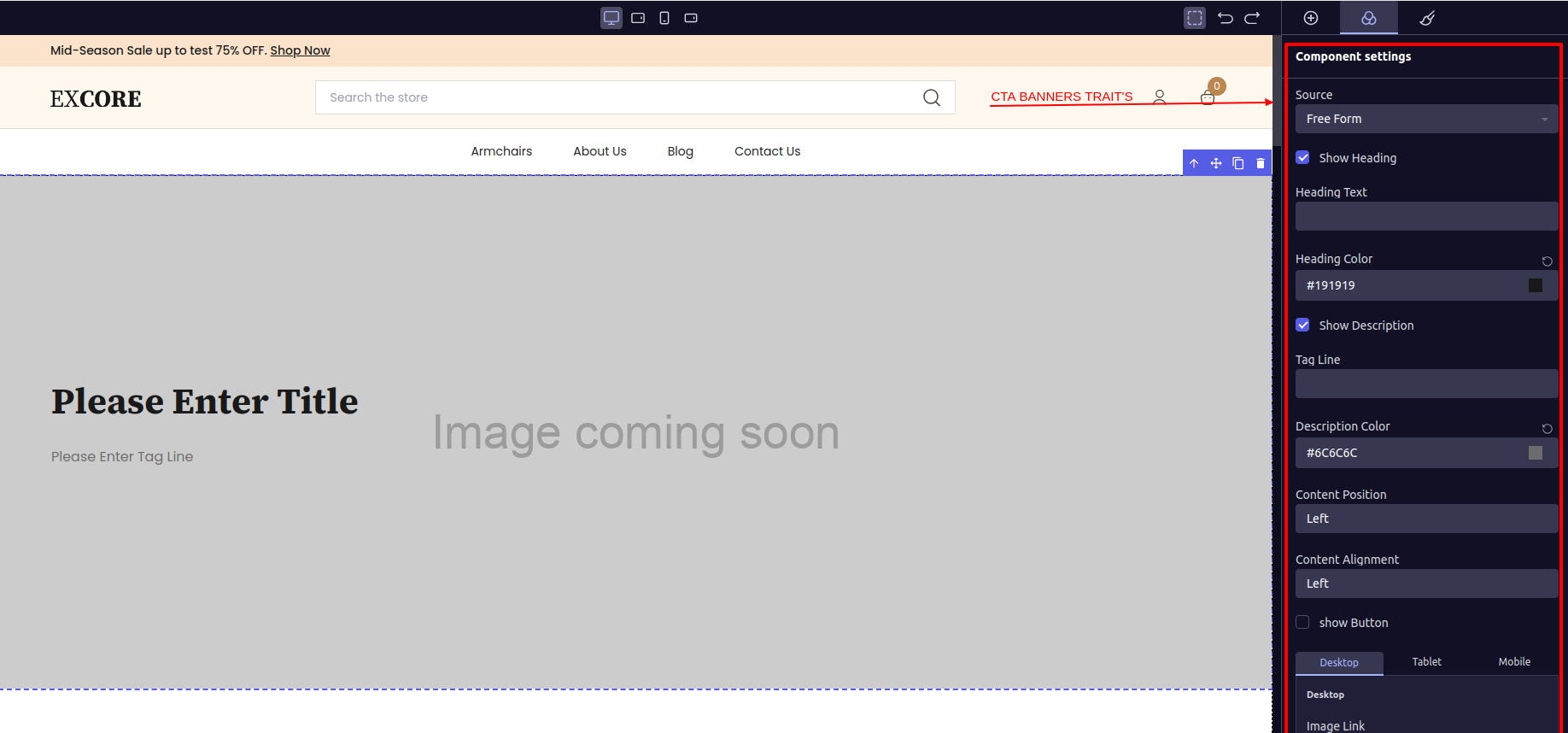 As observed, the `cta-banner` widget incorporates multiple traits such as selecting the 'Data Source' via a `Drop Down`, a trait for 'Show Heading' represented by a `checkbox`, 'Heading Text' which is a `text` input, 'Heading color' trait offered through a `color-picker`, and several `Widget` file.
To enable these traits to appear on the `CTA Banner` or any other `Widget's` side panel, you must specify the configuration for each trait in the widget file of the `Widget` file.
Here is a `initialValue` object of `CTA Banner`,
```js theme={null}
const [OR, AND] = ["OR", "AND"];
const [WIDGET_CHECK_TRUE, WIDGET_CHECK_FALSE] = ["on", "off"];
const [CONTENT_LIBRARY, FREE_FORM] = ["contentLibrary", "freeForm"];
const initialValue: any = {
contentModel: "",
headingText: "",
dataSource: FREE_FORM,
modelInternalName: "cta_banner",
showHeadingText: WIDGET_CHECK_TRUE,
contentPosition: "justify-left",
preLoadImage: WIDGET_CHECK_FALSE,
headingColor: "#191919",
traitConfig: [
{
type: "exp_dataSourceDropDown",
},
{
type: "exp_contentModalPopUp",
modelInternalName: "cta_banner",
dependent: "dataSource",
subDependency: CONTENT_LIBRARY,
},
{
type: "exp_checkbox",
displayName: "Show Heading",
internalName: "showHeadingText",
},
{
type: "exp_text",
displayName: "Heading Text",
internalName: "headingText",
dependencyConfig: {
config: [
{
name: "showHeadingText",
value: [WIDGET_CHECK_TRUE],
},
{
name: "dataSource",
value: [FREE_FORM],
},
],
operator: AND,
},
},
{
type: "exp_colorPicker",
displayName: "Heading Color",
internalName: "headingColor",
dependent: "showHeadingText",
subDependency: WIDGET_CHECK_TRUE,
},
{
type: "exp_dropDown",
displayName: "Content Position",
internalName: "contentPosition",
options: [
{ name: "Left", value: "justify-left" },
{ name: "Center", value: "justify-center" },
{ name: "Right", value: "justify-right" },
],
dependencyConfig: {
config: [
{
name: "showTagLine",
value: [WIDGET_CHECK_TRUE],
},
{
name: "showHeadingText",
value: [WIDGET_CHECK_TRUE],
},
],
operator: OR,
},
},
{
type: "exp_checkbox",
displayName: "Pre Load Image",
internalName: "preLoadImage",
dependent: "dataSource",
subDependency: CONTENT_LIBRARY,
},
{
type: "exp_imageSelector",
displayName: "Background Image",
internalName: "backgroundImage",
dependent: "dataSource",
subDependency: FREE_FORM,
},
],
};
```
The `initialValue` object shows how traits are configured. Each object in the `traitConfig` array represents a trait visible on the side panel. It's important to understand terms like `dependent`, `subDependency`, and `dependencyConfig`, and know when to use them based on your needs. This understanding is key to setting up traits effectively.
##### What is internalName?
All the trait values will be accessible in the components `props` and `comonent_content` as well. You can access the trait values using the key you specified in the trait object as the 'internalName'. Where it is must to provide the 'internalName' for each trait exapt some trait type which are already metioned in ###Available trait types.
For example,
`internalName: "showHeadingText",`
`internalName: "preLoadImage"`.
##### What is displayName?
The value you provide for the 'displayName' key in the trait object will be displayed as the **label** of the trait on the side panel. This label serves as a descriptive title for the trait, helping users understand its purpose or function.
***
Let's go through each object provided in the `traitConfig`.
```js theme={null}
{
type: "exp_dataSourceDropDown",
},
```
This is a custom trait type provided by the `experro-storefront`. To use it, you only need to specify the `type` in the `traitConfig` object, as shown in the `initialValue` object above.
This trait provides a dropdown with two values to select from: "**Content Library**" and "**Free Form**". The selected value will be available in the `dataSource` key, which is predefined.
***
Alright, let's examine the second trait object, `exp_contentModalPopUp`.
```js theme={null}
{
type: "exp_contentModalPopUp",
modelInternalName: "cta_banner",
dependent: "dataSource",
subDependency: CONTENT_LIBRARY,
},
```
This trait displays two fields on the side panel. The first field is labeled '**Content Model**', showing the name of the Content Model. The second field is labeled '**Content Model Record**'. When clicked, it opens a `pop-up` listing all the records associated with that Content Model in Experro's admin panel.
As observed, the `cta-banner` widget incorporates multiple traits such as selecting the 'Data Source' via a `Drop Down`, a trait for 'Show Heading' represented by a `checkbox`, 'Heading Text' which is a `text` input, 'Heading color' trait offered through a `color-picker`, and several `Widget` file.
To enable these traits to appear on the `CTA Banner` or any other `Widget's` side panel, you must specify the configuration for each trait in the widget file of the `Widget` file.
Here is a `initialValue` object of `CTA Banner`,
```js theme={null}
const [OR, AND] = ["OR", "AND"];
const [WIDGET_CHECK_TRUE, WIDGET_CHECK_FALSE] = ["on", "off"];
const [CONTENT_LIBRARY, FREE_FORM] = ["contentLibrary", "freeForm"];
const initialValue: any = {
contentModel: "",
headingText: "",
dataSource: FREE_FORM,
modelInternalName: "cta_banner",
showHeadingText: WIDGET_CHECK_TRUE,
contentPosition: "justify-left",
preLoadImage: WIDGET_CHECK_FALSE,
headingColor: "#191919",
traitConfig: [
{
type: "exp_dataSourceDropDown",
},
{
type: "exp_contentModalPopUp",
modelInternalName: "cta_banner",
dependent: "dataSource",
subDependency: CONTENT_LIBRARY,
},
{
type: "exp_checkbox",
displayName: "Show Heading",
internalName: "showHeadingText",
},
{
type: "exp_text",
displayName: "Heading Text",
internalName: "headingText",
dependencyConfig: {
config: [
{
name: "showHeadingText",
value: [WIDGET_CHECK_TRUE],
},
{
name: "dataSource",
value: [FREE_FORM],
},
],
operator: AND,
},
},
{
type: "exp_colorPicker",
displayName: "Heading Color",
internalName: "headingColor",
dependent: "showHeadingText",
subDependency: WIDGET_CHECK_TRUE,
},
{
type: "exp_dropDown",
displayName: "Content Position",
internalName: "contentPosition",
options: [
{ name: "Left", value: "justify-left" },
{ name: "Center", value: "justify-center" },
{ name: "Right", value: "justify-right" },
],
dependencyConfig: {
config: [
{
name: "showTagLine",
value: [WIDGET_CHECK_TRUE],
},
{
name: "showHeadingText",
value: [WIDGET_CHECK_TRUE],
},
],
operator: OR,
},
},
{
type: "exp_checkbox",
displayName: "Pre Load Image",
internalName: "preLoadImage",
dependent: "dataSource",
subDependency: CONTENT_LIBRARY,
},
{
type: "exp_imageSelector",
displayName: "Background Image",
internalName: "backgroundImage",
dependent: "dataSource",
subDependency: FREE_FORM,
},
],
};
```
The `initialValue` object shows how traits are configured. Each object in the `traitConfig` array represents a trait visible on the side panel. It's important to understand terms like `dependent`, `subDependency`, and `dependencyConfig`, and know when to use them based on your needs. This understanding is key to setting up traits effectively.
##### What is internalName?
All the trait values will be accessible in the components `props` and `comonent_content` as well. You can access the trait values using the key you specified in the trait object as the 'internalName'. Where it is must to provide the 'internalName' for each trait exapt some trait type which are already metioned in ###Available trait types.
For example,
`internalName: "showHeadingText",`
`internalName: "preLoadImage"`.
##### What is displayName?
The value you provide for the 'displayName' key in the trait object will be displayed as the **label** of the trait on the side panel. This label serves as a descriptive title for the trait, helping users understand its purpose or function.
***
Let's go through each object provided in the `traitConfig`.
```js theme={null}
{
type: "exp_dataSourceDropDown",
},
```
This is a custom trait type provided by the `experro-storefront`. To use it, you only need to specify the `type` in the `traitConfig` object, as shown in the `initialValue` object above.
This trait provides a dropdown with two values to select from: "**Content Library**" and "**Free Form**". The selected value will be available in the `dataSource` key, which is predefined.
***
Alright, let's examine the second trait object, `exp_contentModalPopUp`.
```js theme={null}
{
type: "exp_contentModalPopUp",
modelInternalName: "cta_banner",
dependent: "dataSource",
subDependency: CONTENT_LIBRARY,
},
```
This trait displays two fields on the side panel. The first field is labeled '**Content Model**', showing the name of the Content Model. The second field is labeled '**Content Model Record**'. When clicked, it opens a `pop-up` listing all the records associated with that Content Model in Experro's admin panel.
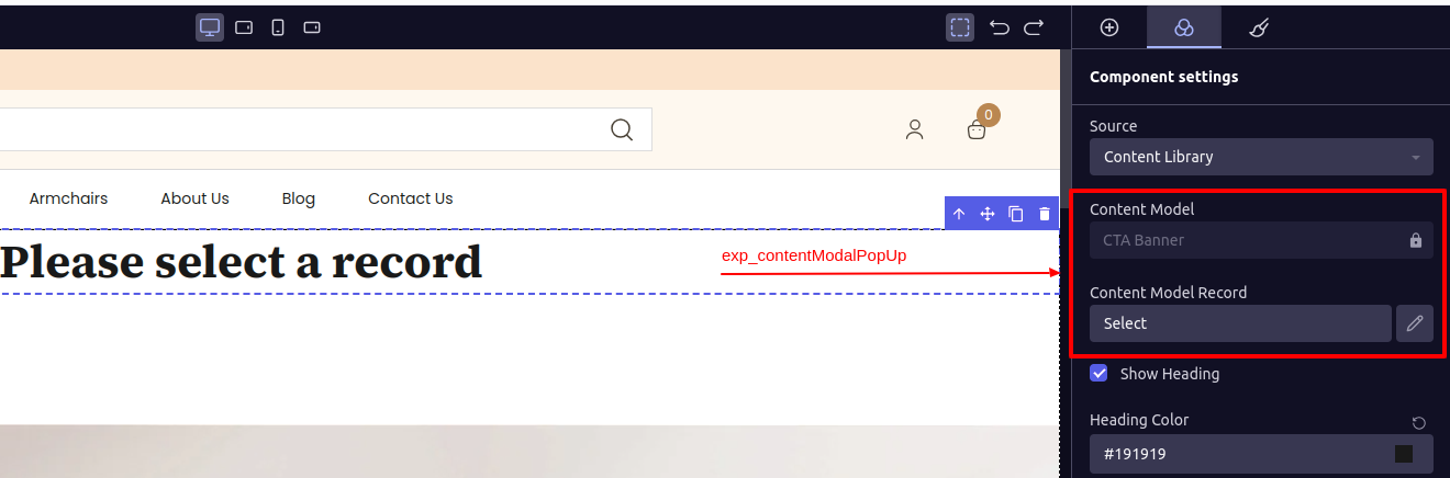 As depicted in the image above, the '**Content Model**' field is displaying '**CTA Banner**'. To integrate it with another Content Model, simply provide the '*Internal Name*' of the desired Content Model, which you can obtain from Experro's admin panel. Pass this Internal Name as the value for the 'modelInternalName' key in the object above.
If you're unsure about where to find the **Internal Name**, you can refer to the guide on how to obtain the Internal Name. You can find it in the section titled ['How to get the Internal Name'](./Get-model-internal-name.md/#how-to-get-the-internal-name-content-model-internal-name).
For example:
`modelInternalName: 'zig-zag-banner'`
An important aspect to note is that after selecting a record from the pop-up, the details of the selected 'Content Library Record' will be available under the key '**contentModel**'. You can access this data in props by destructuring '*component\_content*' and accessing the key "**contentModel**". From the records data, you can retrieve the actual record data by making an API call. You'll need to pass the data obtained in '**contentModel**' as parameters for the API call.
Next, you can see the key provided is '**dependent**' and '**subDependency**'.
#### What is *dependent* & *subDependency*?
1. **dependent:**
```txt theme={null}
In the CTA Banner widget, it's necessary for this trait to be visible on the sidepanel only when a 'dataSource' is selected.
For instance, if the 'dataSource' trait has a selected value, then this trait will become visible on the side panel. Although we used the 'dataSource' trait as an example, you can and should provide any other valid trait '*internalName*'.
From the provided `traitConfig`, examples could include '*showHeading*', '*headingText*', and so on.
```
2. **subDependency:**
```txt theme={null}
This is an enhancement built upon the '**dependent**' key provided within a trait object. It operates by making a field visible only when the value of another trait meets specific criteria.
For instance, if the '*dataSource*' trait has a selected value of '*contentLibrary*', then this trait should become visible. Therefore, the value passed to the '**dependent**' trait should match the internal name of the trait value you specified.
```
***
Alright, let's examine the second trait object, `exp_checkbox`.
```js theme={null}
{
type: "exp_checkbox",
displayName: "Show Heading",
internalName: "showHeadingText",
},
```
This trait presents a checkbox labeled as '*Show Heading*'. When the checkbox is checked, it returns the value '*on*'; when unchecked, it returns '*off*'.
***
#### What is dependencyConfig?
As you may have observed in the [What is *dependent* & *subDependency?*](#what-is-dependent--subdependency) section, '*dependent*' and '*subDependency*' bind a single trait to the trait you're specifying as the dependency. In contrast, the **dependencyConfig** enables you to associate a single trait with multiple traits and their respective values.
For instance, consider the trait for 'Heading Text'. We intend for this trait to be visible when the value of '*showHeadingText*' is '*on*' AND '*dataSource*' is '*freeForm*'. To achieve this, we've included the `config` array containing all `dependencyConfig` objects structured as `{ name: 'internalName Of Other Trait' , value: 'Value for which you are binding a trait'}`.
Finally, you'll need to specify an `operator` for the **dependencyConfig**. You can use 'AND' to ensure that all the objects passed in **dependencyConfig's** **config** must match the cases. Alternatively, you can use 'OR' to match any one case from the **config**.
***
Next, up is `exp_text` with `dependencyConfig`.
```js theme={null}
{
type: "exp_text",
displayName: "Heading Text",
internalName: "headingText",
dependencyConfig: {
config: [
{
name: "showHeadingText",
value: [WIDGET_CHECK_TRUE],
},
{
name: "dataSource",
value: [FREE_FORM],
},
],
operator: AND,
},
},
```
As observed in the above trait object, this trait pertains to 'Heading Text', offering a 'Text Input' for input. Its value will be accessible within the component's props using the key specified in '*internalName*' as '`headingText`'.
Let's break down the **dependencyConfig** for better understanding. In the **config** array, you can see that this trait relies on two other traits: '*showHeadingText*' must be '*on*', and '*dataSource*' must be '*freeForm*'. Since we've set the operator as '*AND*', both conditions must be met for the dependency to take effect.
***
Now, let's take a look at `exp_imageSelector` type,
```js theme={null}
{
type: "exp_imageSelector",
displayName: "Background Image",
internalName: "backgroundImage",
dependent: "dataSource",
subDependency: FREE_FORM,
},
```
This trait type will provides a out put as below image,
As depicted in the image above, the '**Content Model**' field is displaying '**CTA Banner**'. To integrate it with another Content Model, simply provide the '*Internal Name*' of the desired Content Model, which you can obtain from Experro's admin panel. Pass this Internal Name as the value for the 'modelInternalName' key in the object above.
If you're unsure about where to find the **Internal Name**, you can refer to the guide on how to obtain the Internal Name. You can find it in the section titled ['How to get the Internal Name'](./Get-model-internal-name.md/#how-to-get-the-internal-name-content-model-internal-name).
For example:
`modelInternalName: 'zig-zag-banner'`
An important aspect to note is that after selecting a record from the pop-up, the details of the selected 'Content Library Record' will be available under the key '**contentModel**'. You can access this data in props by destructuring '*component\_content*' and accessing the key "**contentModel**". From the records data, you can retrieve the actual record data by making an API call. You'll need to pass the data obtained in '**contentModel**' as parameters for the API call.
Next, you can see the key provided is '**dependent**' and '**subDependency**'.
#### What is *dependent* & *subDependency*?
1. **dependent:**
```txt theme={null}
In the CTA Banner widget, it's necessary for this trait to be visible on the sidepanel only when a 'dataSource' is selected.
For instance, if the 'dataSource' trait has a selected value, then this trait will become visible on the side panel. Although we used the 'dataSource' trait as an example, you can and should provide any other valid trait '*internalName*'.
From the provided `traitConfig`, examples could include '*showHeading*', '*headingText*', and so on.
```
2. **subDependency:**
```txt theme={null}
This is an enhancement built upon the '**dependent**' key provided within a trait object. It operates by making a field visible only when the value of another trait meets specific criteria.
For instance, if the '*dataSource*' trait has a selected value of '*contentLibrary*', then this trait should become visible. Therefore, the value passed to the '**dependent**' trait should match the internal name of the trait value you specified.
```
***
Alright, let's examine the second trait object, `exp_checkbox`.
```js theme={null}
{
type: "exp_checkbox",
displayName: "Show Heading",
internalName: "showHeadingText",
},
```
This trait presents a checkbox labeled as '*Show Heading*'. When the checkbox is checked, it returns the value '*on*'; when unchecked, it returns '*off*'.
***
#### What is dependencyConfig?
As you may have observed in the [What is *dependent* & *subDependency?*](#what-is-dependent--subdependency) section, '*dependent*' and '*subDependency*' bind a single trait to the trait you're specifying as the dependency. In contrast, the **dependencyConfig** enables you to associate a single trait with multiple traits and their respective values.
For instance, consider the trait for 'Heading Text'. We intend for this trait to be visible when the value of '*showHeadingText*' is '*on*' AND '*dataSource*' is '*freeForm*'. To achieve this, we've included the `config` array containing all `dependencyConfig` objects structured as `{ name: 'internalName Of Other Trait' , value: 'Value for which you are binding a trait'}`.
Finally, you'll need to specify an `operator` for the **dependencyConfig**. You can use 'AND' to ensure that all the objects passed in **dependencyConfig's** **config** must match the cases. Alternatively, you can use 'OR' to match any one case from the **config**.
***
Next, up is `exp_text` with `dependencyConfig`.
```js theme={null}
{
type: "exp_text",
displayName: "Heading Text",
internalName: "headingText",
dependencyConfig: {
config: [
{
name: "showHeadingText",
value: [WIDGET_CHECK_TRUE],
},
{
name: "dataSource",
value: [FREE_FORM],
},
],
operator: AND,
},
},
```
As observed in the above trait object, this trait pertains to 'Heading Text', offering a 'Text Input' for input. Its value will be accessible within the component's props using the key specified in '*internalName*' as '`headingText`'.
Let's break down the **dependencyConfig** for better understanding. In the **config** array, you can see that this trait relies on two other traits: '*showHeadingText*' must be '*on*', and '*dataSource*' must be '*freeForm*'. Since we've set the operator as '*AND*', both conditions must be met for the dependency to take effect.
***
Now, let's take a look at `exp_imageSelector` type,
```js theme={null}
{
type: "exp_imageSelector",
displayName: "Background Image",
internalName: "backgroundImage",
dependent: "dataSource",
subDependency: FREE_FORM,
},
```
This trait type will provides a out put as below image,
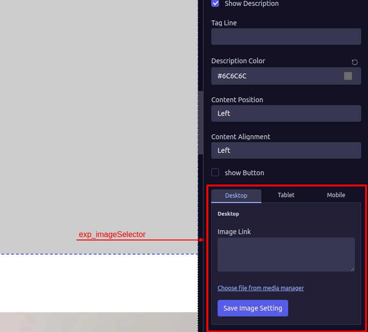 You'll notice three tabs labeled 'Desktop,' 'Tablet,' and 'Mobile' for viewing image links, which you can input into the "Image Link" text area. When you input an image link for the desktop tab, it automatically populates the same link for the Tablet and Mobile views. Additionally, you have the option to provide three different images for each specified device.
You also have the option to select images from Experro's 'Media Manager' by clicking on the provided '*Choose file from Media Manager*' button.
Choose file from Media Manager\` will not work while you are developing theme in your local system.
According to this trait, it is identified by the `internalName` attribute, which is set as *backgroundImage*. Therefore, you will retrieve the value of this trait from the component's props under the key named *backgroundImage*.
You simply need to assign that value to the `src` prop of the **ExpImage** Common-component.
***
By using and customizing these traits, you have the flexibility to make the necessary changes to your widget as required.
Now, let's grasp how we can seamlessly [Integrate the widget](./integrate-a-component-with-widget) we've created with a component.
You'll notice three tabs labeled 'Desktop,' 'Tablet,' and 'Mobile' for viewing image links, which you can input into the "Image Link" text area. When you input an image link for the desktop tab, it automatically populates the same link for the Tablet and Mobile views. Additionally, you have the option to provide three different images for each specified device.
You also have the option to select images from Experro's 'Media Manager' by clicking on the provided '*Choose file from Media Manager*' button.
Choose file from Media Manager\` will not work while you are developing theme in your local system.
According to this trait, it is identified by the `internalName` attribute, which is set as *backgroundImage*. Therefore, you will retrieve the value of this trait from the component's props under the key named *backgroundImage*.
You simply need to assign that value to the `src` prop of the **ExpImage** Common-component.
***
By using and customizing these traits, you have the flexibility to make the necessary changes to your widget as required.
Now, let's grasp how we can seamlessly [Integrate the widget](./integrate-a-component-with-widget) we've created with a component.