> ## Documentation Index
> Fetch the complete documentation index at: https://help.experro.com/llms.txt
> Use this file to discover all available pages before exploring further.
# Types of traits
experr-storefront offers a range of traits for seamless integration with the component, each designed to enhance and expand the capabilities of your storefront. Traits provided by the experr-storefront are as follows:
1. #### exp\_text ( Textbox ):
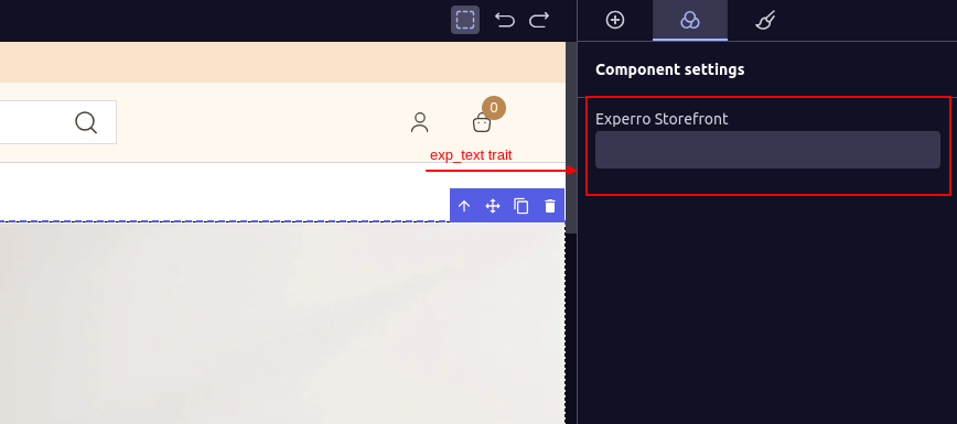
The `exp_text` trait adds a text box to the sidebar of the visual builder, allowing for easy content editing.
To render `exp_text`, pass the below object to the trait configuration.
```js theme={null}
{
type: "exp_text",
displayName: "Experro Storefront",
internalName: "experroStorefront",
}
```
When you include `exp_text` in the traitConfig array of the component's initial value, a text box will be rendered in the sidebar of the UI builder. The `displayName` will serve as the label for that text box.
 ***
2. #### exp\_textArea ( Text Area ):
The `exp_textArea` trait adds a text Area to the sidebar of the visual builder.
traitConfig Object:
```js theme={null}
{
type: "exp_textArea",
displayName: "Experro Storefront",
internalName: "experroStorefront",
}
```
***
2. #### exp\_textArea ( Text Area ):
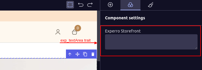
The `exp_textArea` trait adds a text Area to the sidebar of the visual builder.
traitConfig Object:
```js theme={null}
{
type: "exp_textArea",
displayName: "Experro Storefront",
internalName: "experroStorefront",
}
```
 ***
3. #### exp\_checkbox ( Checkbox ):
The `exp_checkbox` trait adds a Checkbox to the sidebar of the visual builder.
traitConfig Object:
```js theme={null}
{
type: "exp_checkbox",
displayName: "Experro Storefront",
internalName: "experroStorefront",
}
```
***
3. #### exp\_checkbox ( Checkbox ):
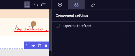
The `exp_checkbox` trait adds a Checkbox to the sidebar of the visual builder.
traitConfig Object:
```js theme={null}
{
type: "exp_checkbox",
displayName: "Experro Storefront",
internalName: "experroStorefront",
}
```
 ***
4. #### exp\_colorPicker ( Color Picker ):
The `exp_colorPicker` trait adds a Color Picker to the sidebar of the visual builder.
```js theme={null}
{
type: "exp_colorPicker",
displayName: "Experro Storefront",
internalName: "experroStorefront",
}
```
***
4. #### exp\_colorPicker ( Color Picker ):
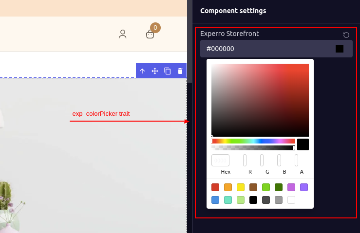
The `exp_colorPicker` trait adds a Color Picker to the sidebar of the visual builder.
```js theme={null}
{
type: "exp_colorPicker",
displayName: "Experro Storefront",
internalName: "experroStorefront",
}
```
 ***
5. #### exp\_dropDown (Drop Down):
The `exp_dropDown` trait adds a Drop Down to the sidebar of the visual builder.
```js theme={null}
{
type: 'exp_dropDown',
displayName: 'Experro Storefront',
internalName: 'experroStorefront',
options: [
{ value: 'value1', name: 'name 1' },
{ value: 'value2', name: 'name 2' },
{ value: 'value3', name: 'name 3' },
]
},
```
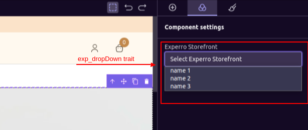
The `options` array is used to populate the dropdown, where each object in the array represents an option. The `name` property specifies the display name for the option, while the `value` property specifies the actual value of the option.
The `displayName` will be used as the placeholder for the dropdown, prefixed with `Select`.
***
5. #### exp\_dropDown (Drop Down):
The `exp_dropDown` trait adds a Drop Down to the sidebar of the visual builder.
```js theme={null}
{
type: 'exp_dropDown',
displayName: 'Experro Storefront',
internalName: 'experroStorefront',
options: [
{ value: 'value1', name: 'name 1' },
{ value: 'value2', name: 'name 2' },
{ value: 'value3', name: 'name 3' },
]
},
```
The `options` array is used to populate the dropdown, where each object in the array represents an option. The `name` property specifies the display name for the option, while the `value` property specifies the actual value of the option.
The `displayName` will be used as the placeholder for the dropdown, prefixed with `Select`.
 ***
6. #### exp\_dataSourceDropDown ( Experro-Storefront Datasource Dropdown ):
The `exp_dataSourceDropDown` is used to render a dropdown menu from which you can select the data source for your component. There are two types of data sources:
1. Content Library
2. Free Form
This trait can be used as a separator for the data. If you want to use data from Experro's content library and also support inserting data from the sidebar settings in the same component, you can use this trait as a flag to determine the data source.
```js theme={null}
{
type: 'exp_dataSourceDropDown',
}
```
For this trait, there will be no `internalName` or `displayName` as they are fixed. The `internalName` is `dataSource`, which is a reserved keyword and cannot be used for other traits' `internalName`.
***
6. #### exp\_dataSourceDropDown ( Experro-Storefront Datasource Dropdown ):
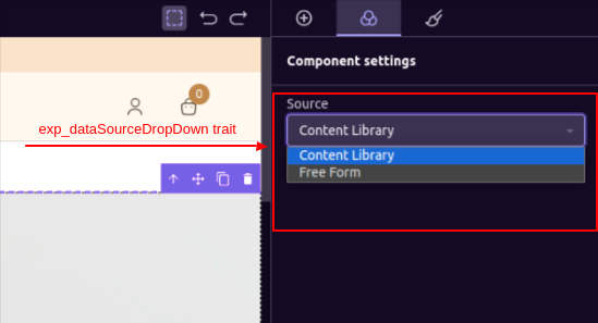
The `exp_dataSourceDropDown` is used to render a dropdown menu from which you can select the data source for your component. There are two types of data sources:
1. Content Library
2. Free Form
This trait can be used as a separator for the data. If you want to use data from Experro's content library and also support inserting data from the sidebar settings in the same component, you can use this trait as a flag to determine the data source.
```js theme={null}
{
type: 'exp_dataSourceDropDown',
}
```
For this trait, there will be no `internalName` or `displayName` as they are fixed. The `internalName` is `dataSource`, which is a reserved keyword and cannot be used for other traits' `internalName`.
 ***
7. #### exp\_contentModalPopUp( Experro-Storefront Content Modal Popup ):
`exp_contentModalPopUp` trait is used when data is sourced from Experro's content library. It displays a selection list in a popup, showing records from Experro's content library for that component.
```js theme={null}
{
type: 'exp_contentModalPopUp',
modelInternalName: '',
}
```
This component also has a fixed internalName of contentModel, which is a reserved keyword.
`modelInternalName` is the modal internal name of the content model. which so ever content models internal name is passed from here that content modals records will shown in the popup
The `modelInternalName` is the modal internal name of the content model. Whichever content model's internal name is passed here, that content model's records will be shown in the popup.
***
7. #### exp\_contentModalPopUp( Experro-Storefront Content Modal Popup ):
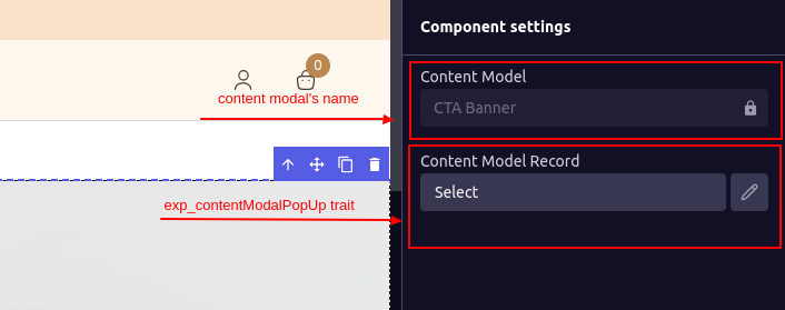
`exp_contentModalPopUp` trait is used when data is sourced from Experro's content library. It displays a selection list in a popup, showing records from Experro's content library for that component.
```js theme={null}
{
type: 'exp_contentModalPopUp',
modelInternalName: '',
}
```
This component also has a fixed internalName of contentModel, which is a reserved keyword.
`modelInternalName` is the modal internal name of the content model. which so ever content models internal name is passed from here that content modals records will shown in the popup
The `modelInternalName` is the modal internal name of the content model. Whichever content model's internal name is passed here, that content model's records will be shown in the popup.
 ***
***