The Categories dashboard reports on the performance of category pages — the navigation-driven entry points where shoppers browse rather than search.

How to Use Categories

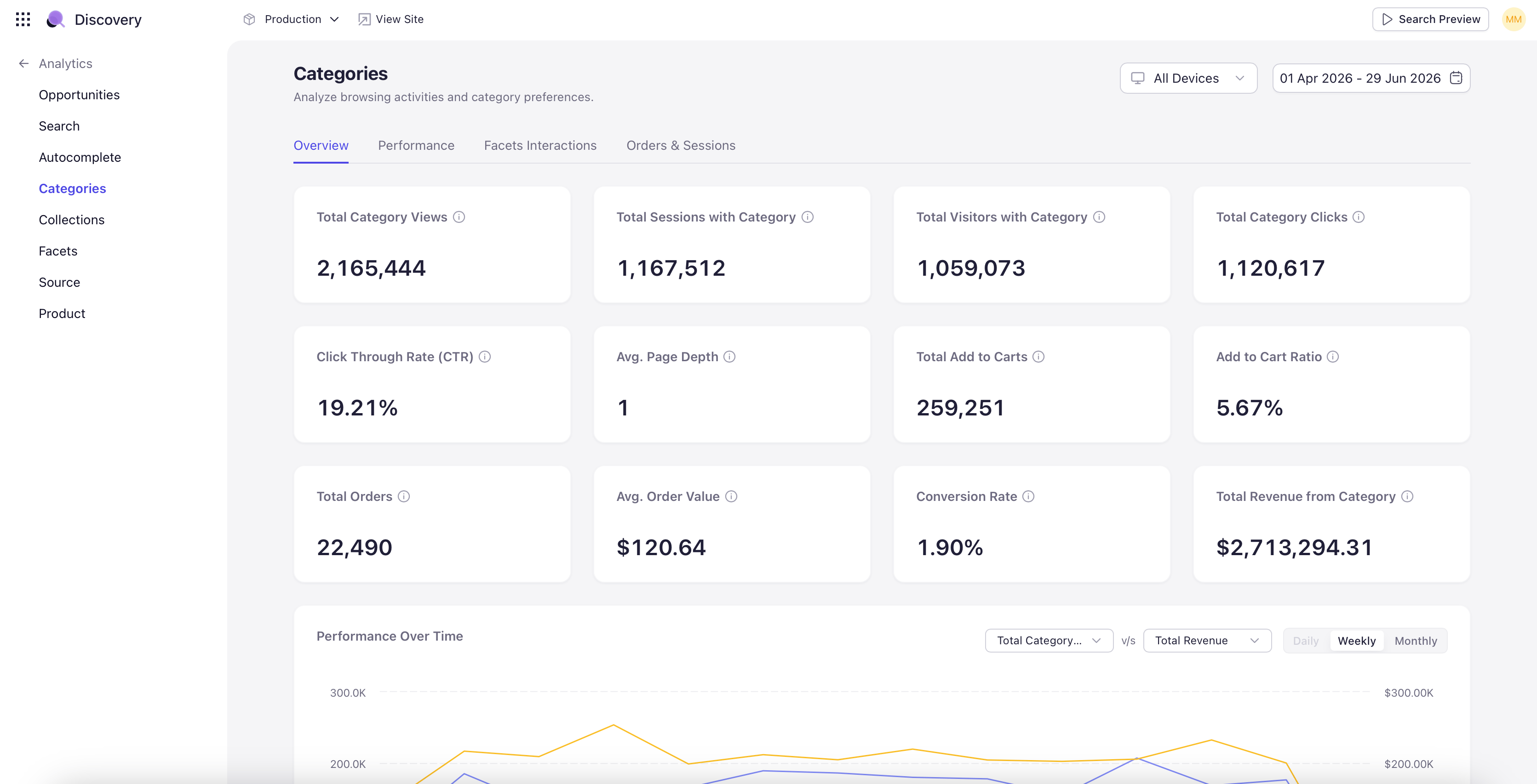
Navigate to the Analytics section and select Categories from the left navigation. Set the site, device, date range, and comparison period from the controls in the upper right. Categories often account for the majority of catalog discovery, especially on mobile and on returning-visitor sessions. The Categories dashboard answers how well that browse experience is converting.

Category KPIs

The dashboard opens with KPI tiles covering the full category funnel — views, clicks, click-through rate, add-to-cart rate, orders, revenue, and conversion rate. Each tile shows the absolute value for the period and the percentage change when Compare is on.

Category Conversion Funnel

A funnel visualization showing how shoppers move from category view to product click to add-to-cart to order. Same shape as the Search funnel but scoped to category-page entries. Hover any stage to see the absolute count and the stage-over-stage conversion rate.

Device Breakdown

A donut chart showing category-driven sessions and revenue split by device (Desktop, Mobile, Tablet). Helpful when mobile categories underperform — often a layout or facet-discoverability problem.

Top Categories

A ranked table of categories by views, with click-through, add-to-cart, orders, and revenue alongside. Click a category row to drill into a per-category dashboard with the same widgets scoped to that one category — useful for understanding why a specific category is over- or under-performing the rest of the catalog.