As the name suggests, this document will help you understand how integrate/implement the draggable and droppabale widgets. Let’s see how you can use drag and drop widgets from the Content-Library. On the right side of the screen, you’ll find the side panel which contains different categories like Basic Components and Theme Components. Inside these categories, you’ll find various widgets such as videos, maps, and more.

Steps to Drag-and-Drop Component and Selecting Record:

Step 1 - Search for the widget that you want to drag and drop. image.png Step 2 - Once you find the widget, drag and drop it in canvas/frame. Once you drop the widget, it displays the initial form of that particular component. Here we have dropped 
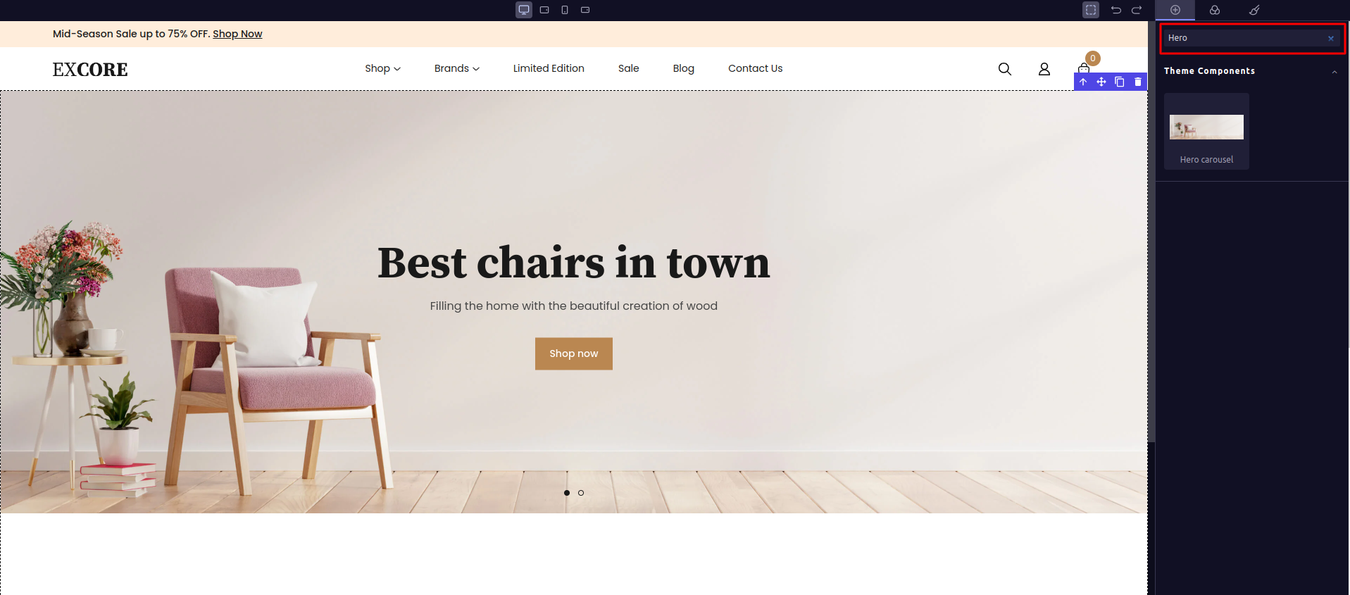
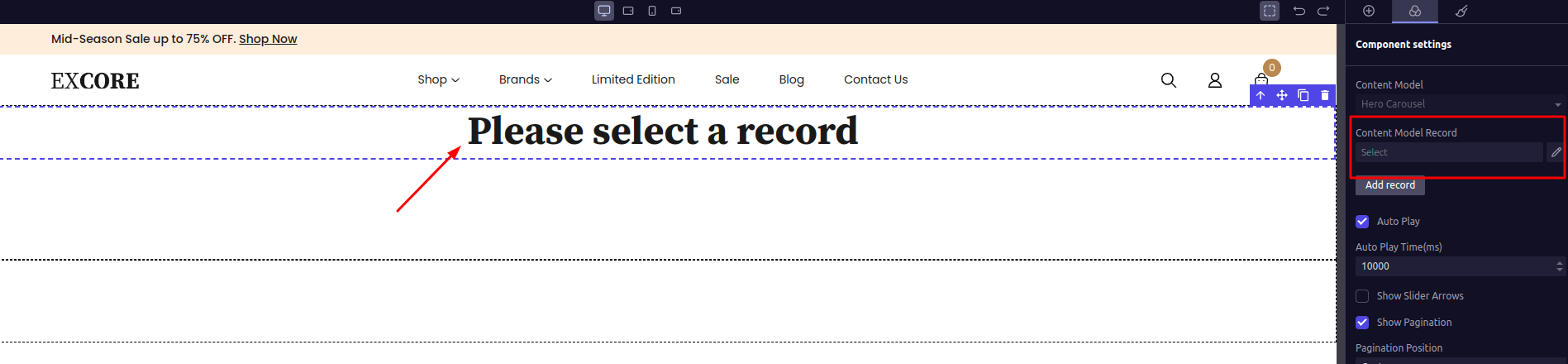
Hero Carousel component which displays “Please Select a Record” that is an initial format for Content-Library. image.png Step 3 - Now select the record from the side panel. These records are the one that user have created in admin panel. image.png Step 4 - Once you have selected the record, it will display in the canvas. You can also edit the content inside the component with the ‘Properties’ options that are shown in the side panel. For example, we have changed the color of the button Shop Now. image.png So, this is how you can drag and drop any widget that Content-Library contains to your web page. Now let’s learn how to inegrate Custom Droppable Widgets in your web page.