

Adding a Facet to a Rule
Open the Facet rule and click Add Facet. The modal asks you to choose a Facet Type — Catalog Field or Custom Facet.Catalog Field
Select one or more indexed fields from your catalog. The dropdown lists each field’s display name, internal name, and data type (string, number, SKU, date). You can add multiple fields in one step — each appears as a chip and becomes a separate facet on save. Catalog Field facets inherit values directly from your catalog and pick up new values automatically.Custom Facet
Manually define values that aren’t available in your catalog. Use this for curated value sets, staging facets while catalog data is being prepared, or facets built from logic combining multiple fields.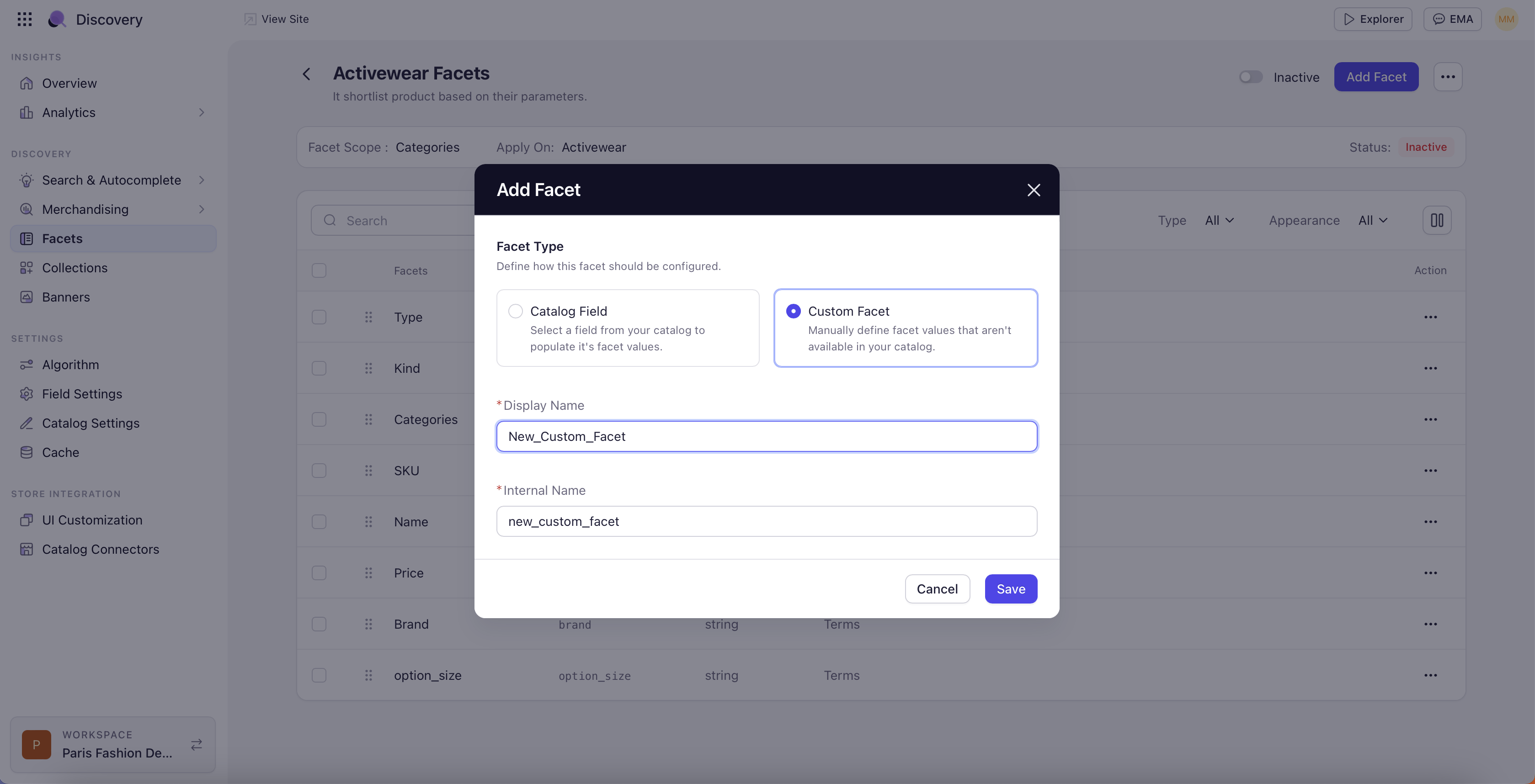
The Edit Facet Screen
Selecting a facet opens the Edit Facet screen with three panels: the facets list on the left, General and Advance tabs in the middle, and the Edit Values panel on the right. For value-level controls in the right panel, see Manage Facet Values.General Tab
Display Name and Internal Name
Display Name is the label shoppers see on the storefront. Internal Name is the read-only catalog field identifier.Facet Appearance
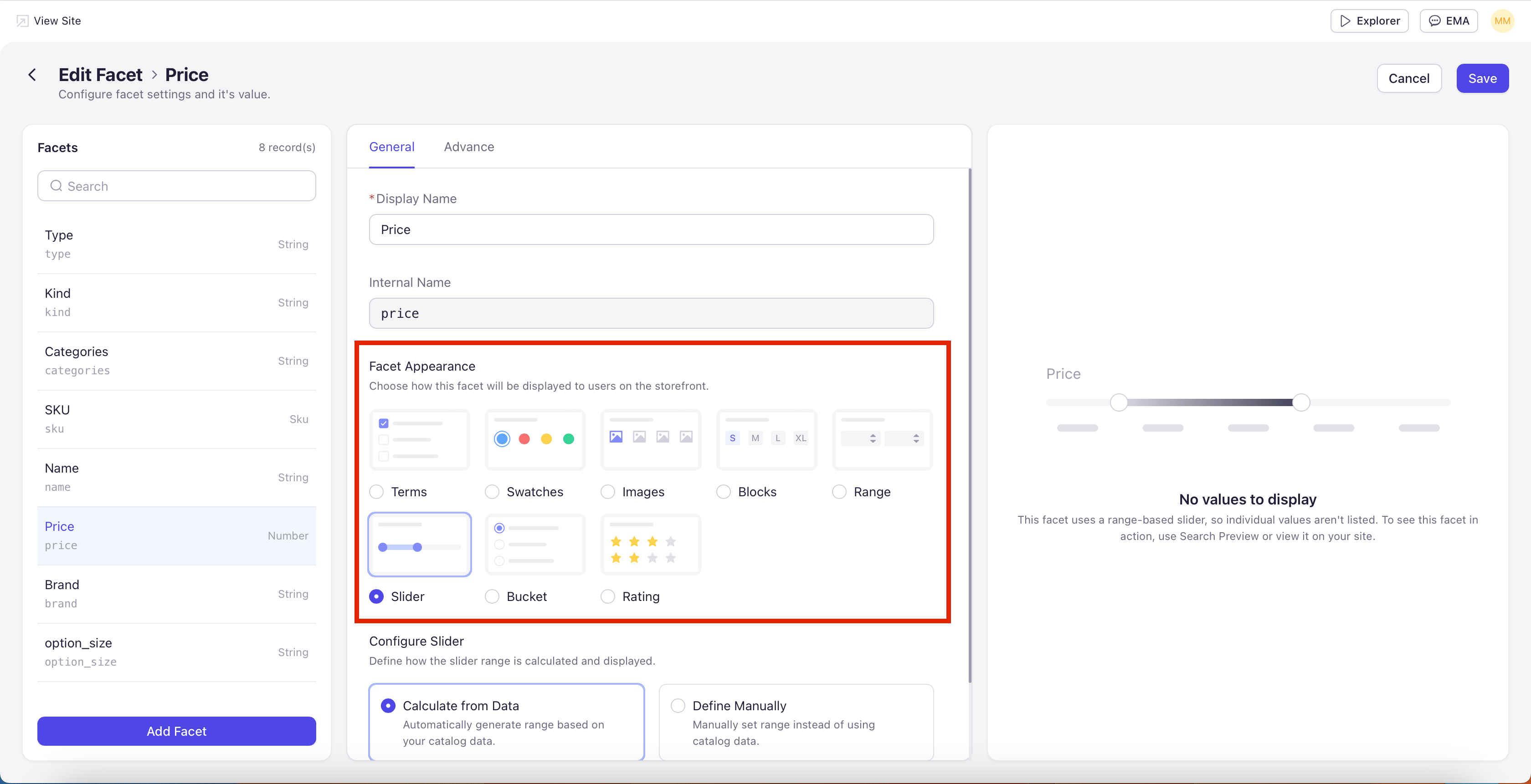
Choose how the facet displays. The available options depend on the field type — incompatible types are greyed out.- String Fields
- Number Fields
- Terms — Standard list of clickable values with checkboxes. The default for most string fields.
- Swatches — Color swatches per value. When selected, the right panel shows a Generate Color Code card with a Generate with AI button that creates color codes from value names (for example, “Navy” produces a navy swatch). You can also pick colors manually.
- Images — Image tiles per value. Upload one image per value in PNG, JPG, or WEBP (100 KB max). Useful when values are best communicated visually (diamond shapes, pattern types).
- Blocks — Tappable block tiles. Common for sizes (S, M, L, XL) and short text values.
Slider
A Slider lets shoppers drag two handles along a track to set a minimum and maximum value. Use it when shoppers want to skim a continuous range quickly, for example Price or Weight. On the storefront, the slider shows the current minimum on the left handle and the current maximum on the right handle, with a filled bar between them indicating the selected range. As shoppers drag, results refresh to reflect the new bounds. What you configure on a Slider rule:- Sort Order, Value Selection, and Show No. of Value (covered below).
- The Advance tab toggles (tooltip, mobile/desktop collapse). Show Search Box does not apply since there are no discrete values to search.
$5 to $499, the slider shows $5 to $499.
Number Fields Only: Slider only appears for number fields. It is greyed out for string fields.
Bucket
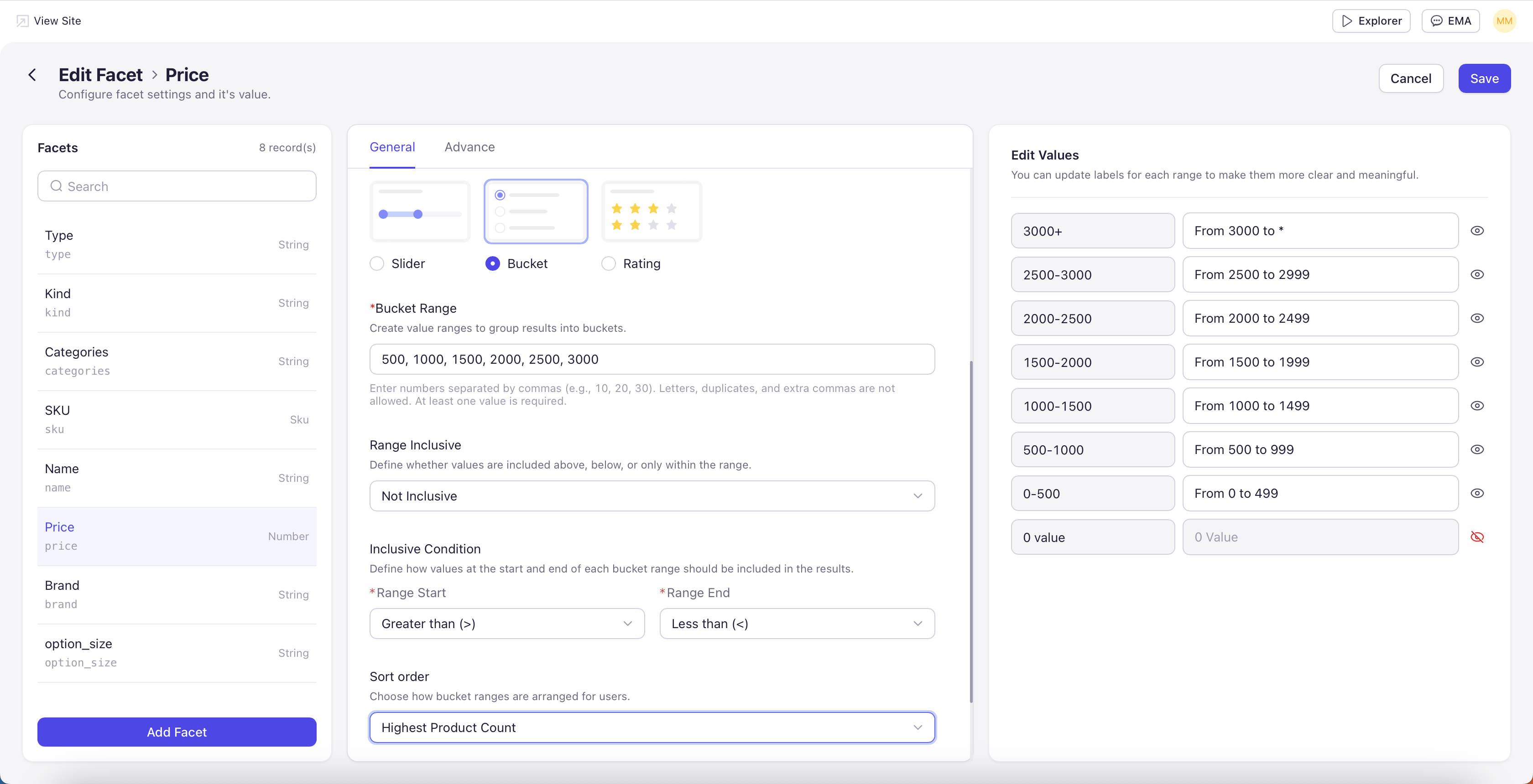
A Bucket displays a list of predefined value ranges that you author. Shoppers tap one of the prepared ranges to filter, rather than entering values themselves. Use it when you want a clean, opinionated set of filter options — for example, Price buckets of$0–$50, $50–$100, $100–$250, and $250+.
On the storefront, each bucket appears as a tappable row (or checkbox, depending on Value Selection). The shopper picks one or more buckets and results update to the union of those ranges.
What you configure on a Bucket rule:
- Each bucket has a lower bound, an upper bound, and a display label.
- Buckets can overlap or leave gaps — the system does not enforce contiguous ranges. Be deliberate so shoppers don’t see duplicates or miss products.
- Sort Order controls the display order. Custom Order lets you arrange buckets manually — typically low to high for price.
Number Fields Only: Bucket only appears for number fields. It is greyed out for string fields.
Rating
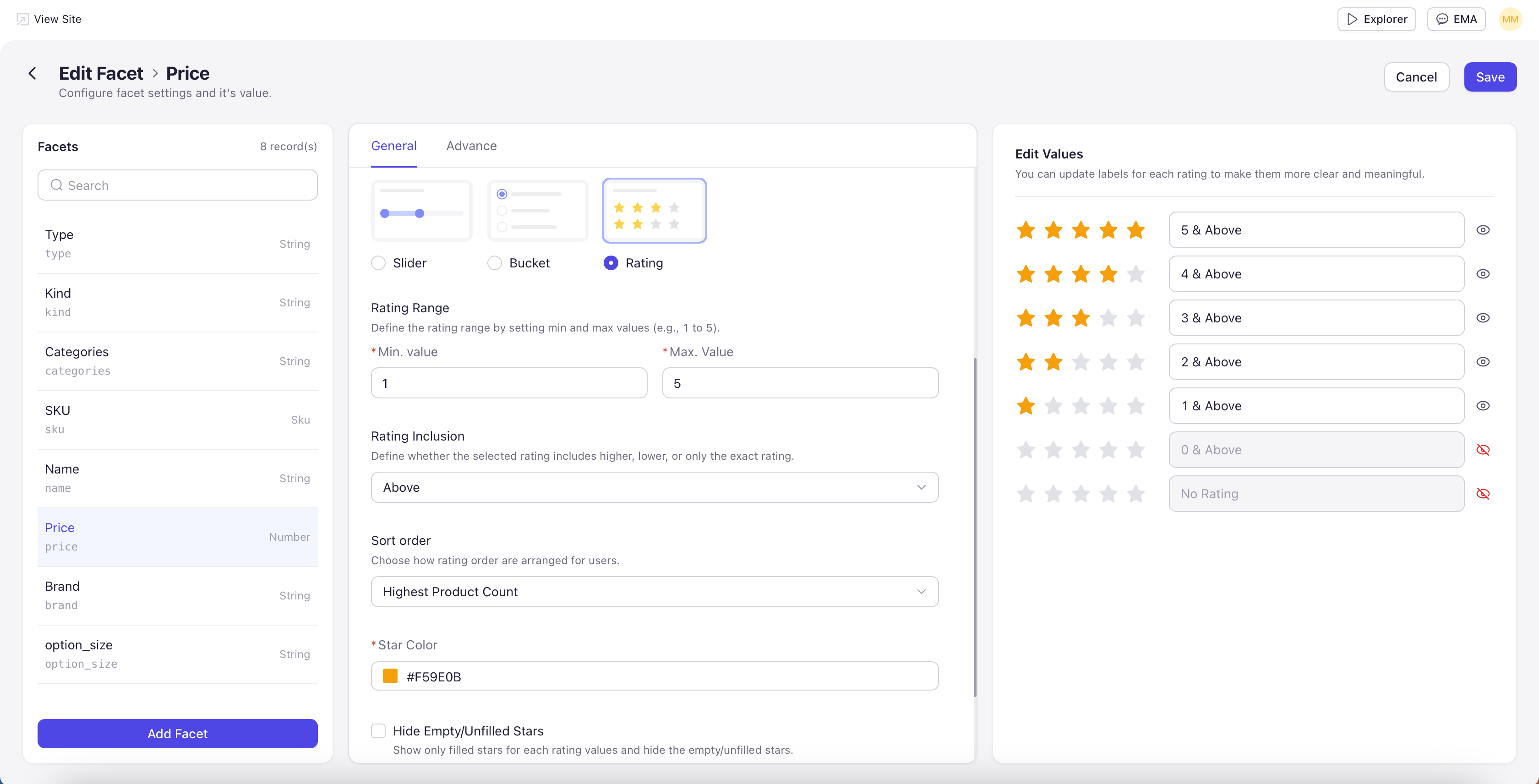
A Rating facet displays star-based filter options designed for review rating fields. Each row shows a star count (for example, four stars) so shoppers can filter to products at or above a given rating with one tap. On the storefront, each row in the Rating facet renders as filled and empty stars matching the row’s value (or only filled stars if you enable that option). Shoppers tap a row to filter by that rating. What you configure on a Rating rule (beyond the standard settings):- Rating Range — Define the rating range by setting minimum and maximum values, for example 1 to 5. Two dropdowns (Min, Max) set the bounds.
- Rating Inclusion — Define whether a selected rating includes higher ratings, lower ratings, or only the exact rating. Common storefront convention is “and above” — selecting four stars returns four- and five-star products.
- Show only filled stars — When enabled, only the filled stars appear for each rating value. Empty stars are hidden. Use this for a cleaner row when shoppers don’t need to see the maximum scale on every line.
Preview Limit: The Edit Values preview shows up to 5 stars only. On the storefront, ratings display according to the Rating Range you configured.
Number Fields Only: Rating only appears for number fields. It is greyed out for string fields.
Sort Order
Define how facet values are arranged for shoppers. The Sort Order dropdown offers five options:- Custom Order — Arrange values manually in your preferred order. Use this for editorial control, for example pinning your house brand to the top.
- Ascending (A-Z) — Alphabetical. Best for facets shoppers scan by name (Brand, Designer).
- Descending (Z-A) — Reverse alphabetical.
- Dynamic Ranking — Values that shoppers click and convert on rise to the top over time. Self-tuning without manual intervention.
- Highest Product Count — Values with the most products first — a safe default for most facets.
Value Selection
Multiple Selection lets shoppers apply more than one value at a time (for example, both Nike and Adidas). Single Selection limits them to one — use this for mutually exclusive facets such as Department or Gender.Show No. of Value
How many values are visible by default before the shopper expands the facet. Default is 5.Advance Tab
Toggle-only settings that affect how the facet renders:- Display Tooltip — Adds a tooltip icon beside the display name.
- Show Search Box — Displays a search box above the values — useful for high-cardinality facets like Brand.
- Collapse by Default for Mobile / Desktop — Collapses the facet on load for that viewport.
- Show Count — Shows product counts next to each value (e.g. “Nike (42)”).